Showing posts with label Typeface Typography. Show all posts

Monday, January 17, 2011

Choosing the Right Fonts to Form Excelent Combinations

0 comments

There are times where designers will need to pick and use several fonts that complement with each other. This is definitely one of the most challenging task since there are no specific rules or font combinations chart for us to follow. Robin Williams classified 3 main types of font combinations, Concord, Contrast and Conflict.


Concord

It is referring to the use of fonts from only one family. The example below uses variations of Helvetica to emphasize the differences between the heading and body texts. There is less fun in creating such designs but is also the safest approach to maintain an elegant and consistent look.

You may also want to take a look at the following related posts:

Contrast

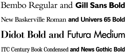
It is about selecting fonts from different families, such as using a Sans Serif along with a Serif font or Oldstyle with Modern font. This is an interesting job where you can mix and match the various selections to form what you think is good and pleasing to the eyes. Below is an example of mix between Helvetica and Garamond.

Conflict

This is opposite of Contrast where the selection of fonts come from two similar families. The fonts have too many similarities that combining them will look more like an error, especially when placed in a single line. The example below shows the combination of Times New Roman and Garamond.

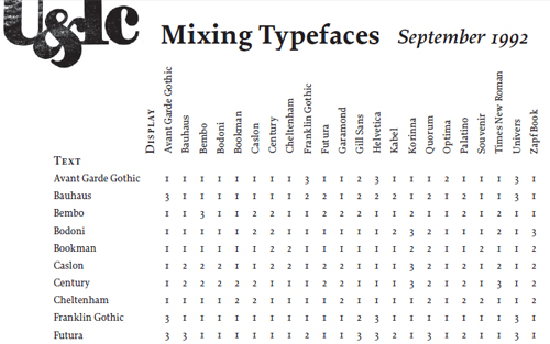
There are a lot more type families for us to play around with our combinations of course. Douglas Bonneville has suggested 19 best combinations made with the most popular fonts below.

Source: 19 Top Fonts in 19 Top Combinations


So what makes a good font combination? As mentioned right at the beginning of the article, there are no specific rules on matching the fonts. If a typography work has the ability to lead a reader’s eye with use of contrast and controlling the order on how the information is to be read, that is a fantastic mixture.

Continue Reading

How To Matching Fonts

0 comments

he history of type design that we've just skimmed through is probably the only useful guide (besides your own experience and preferences, of course) in choosing fonts for "plain text," one-face projects. In such cases your single concern should be about a good match between the style, semantics, and intended impact of your text and corresponding properties of the typeface it uses. You can't set Shakespeare plays in a sans serif font (even of the "humanist" variety), and fragile Modern serifs are not appropriate for a pushy advertisement message.


However, the majority of design projects pose much more difficult problems: Most often, you have to find two or more different typefaces, each matching not only its corresponding text but also all other fonts in the composition. As I've once noted, creating solid contrast links between different fonts is a real challenge. Each font being nearly as complex as a human being, it is next to impossible to find two fonts whose features, so to say, point in opposite directions but along the same line---which is a necessary prerequisite for any contrast link.

You may also want to take a look at the following related posts:

Therefore, the safest option in any project is using the same font, or its different variants (e.g. bold or italic), for all of your needs. This "monofont" solution may not be perfect, but in many cases it may be better to ensure one more aspect of consistency instead of taking risky aesthetic decisions. Using one font is by far preferable in small compositions such as logos, where two or (God forbid) more fonts would have too little room to show their true nature, and any difference between them would therefore become an annoyance rather than a meaningful opposition.

But, let's say you really need two fonts for your work (for example, one for headings and the other for body text), and you're not satisfied by using variations of the same font. Which pair to choose? The basic answer is well known: serif fonts work fine with sans serifs, and vice versa. These two types of fonts are different enough for their contrast to be immediately obvious, resulting in a strong and stable connection.

Here again, the font history may give you valuable hints on which sans serif and serif faces work best together. As these two font types were not developed in parallel, we cannot base our decisions on historical synchronism; most, if not all, today's serif faces are rooted in past ages, while the majority of sans serifs were created in the current century. More useful is matching the level of "humanization," liberty and even looseness vs. that of rigidness and artificiality. Remembering what I've said about the general trends of dehumanization of serifs and humanization of sans serifs, we may conclude that early serif faces should be a good match for late sans serifs, and vice versa.

In fact, I'm not sure if it is possible to successfully combine late Modern serifs with early geometric sans serifs---both these designs are dehumanized to the point of being dry and even awkward, but their underlying ideologies are too different and even disparate. However, for higher levels of humanization this recipe works perfectly; just consider that the basic pair of typefaces for all operating systems are Times and Helvetica, which are a good match because they're both transitional---that is, not too "zealous" but not too liberal either.


Link 1: The Russian Internet is thoroughly Humanist
For another example, look at the logo of a Russian magazine called Internet. [Link no longer in service. -Ed] Although, as I said, different fonts should be avoided in logos, here the two humanist faces, Garamond and Frutiger, work perfectly together because there's no visual in the composition and the fonts are left to interact only with each other, and because the contrast between them is so deep and multiaspect (in font, face, color, and slant). Moreover, the same two fonts are extensively used throughout the magazine itself (more consistently in the print version than on the site, due to the obvious HTML restrictions).

The AlphaWorks site offers a similar yet contradicting example. As most other IBM sites, this one was developed by Studio Archetype; however, the decision to make a logo from the humanist Meta sans serif font (particularly favored by this studio's designers) and an old-fashioned Modern serif font (which is traditional for IBM's corporate style) resulted in a composition of questionable merits---exactly because of the clashing levels of humanization in these two fonts. It is difficult to suppress the feeling that the contrast in this logo is either insufficient or irrelevant.
Link 2: Studio Archetype and IBM meet (font) face to (font) face

As you may conclude from these examples, it is usually a good idea to accompany the contrast of fonts by the contrast of other typesetting aspects, particularly font variations (bold, italic, etc.). These variations are possible along the axes of weight, slant, and width---but you should understand that these axes are not equally applicable to different font types.

You may have noticed that many sans serif fonts do not have italics in the proper sense, but only slanted (sometimes called oblique) variations. This is not by accident; the very nature of sans serif design doesn't allow for an easy transformation into an italic face (or at least, into what we're accustomed to regard as such). Contrary to that, most serif fonts have really dinky italics that, despite having very different lettershapes, are well dovetailed with the roman variety.

On the other hand, demibold and especially bold variations do not work particularly well with many serif faces---their serifs seem to obstruct the change in weight, and the relative difference in strokes' thickness (i.e. the level of contrast) is difficult to preserve in different weights. (Interestingly, a high level of contrast is less of an obstacle for changing weight---hence the extra-bold Fat Face and its likes, built upon Modern serif fonts with their increased contrast.) Sans serifs, on the contrary, are very easygoing when it comes to changing weight---many of them have a wide range of weight variations, from extra light to extra bold. This means that each font has its own most natural variations, and you must take these into account when working with fonts; for example, in a professional work you're much more likely to see a combination of a bold sans serif font and an italic serif font than vice versa.

What are other ways to increase contrast in a multi-font composition? Sure, a serif/sans serif pair is not the most conflicting of all possible font combinations. You could take, for example, an enticing decorative font, such as a stylized blackletter or script face, and put it alongside a plain sans serif font. Unfortunately, such extreme combinations are rarely satisfying. When fonts are too different, they can't live happily together; as we've already found out, contrast is the strongest between two objects when their opposite features are many, but some common traits are still there.

You certainly cannot use a peculiar decorative font for all text on the page, if only because such fonts are often barely legible. If you've used a fancy font for a heading or logo, try to be as discreet as possible in your other font choices. As I've said, stylistically sans serif is not the best match for decorative faces; however, it is often better to environ a complex-shaped fancy heading with a plain, graphically poor sans serif text blocks than with a serif font which usually has a much stronger personality. It is also advisable to use quite different sizes and colors for the two fonts, in order to move their contrast from the dimension of lettershapes to the more flexible opposition of sizes, colors, and visibility.

It is worth noting that professional designers rarely use something besides the simple, traditional typefaces. I intentionally restricted my historical sketch to the mainstream type design, because I believe that for a beginner designer it's much more important to carefully study a small set of classical typefaces than to indulge in "cool" designs, often of questionable quality. The well-known fonts are almost "transparent" for perception not because they're primitive, but on the contrary, because their complexity is well balanced, because they're carefully polished by their creators and by the centuries of use. It is this transparency that allows the immaterial qualities of your text and design show through the material envelope of the font.
Continue Reading

How To Mastering Font Combinations

0 comments

Remember the days of the Commodore computer? Your word processor had one font family, with an italic and a boldface, if you were lucky. Designing a contrasting header to a computer-generated document required scissors and tape.

Though the output of your dot matrix printer was unmistakable and monotonous, at least you never had to sweat the aesthetics of combining type. Matching heading fonts with body fonts, accent fonts and footnote fonts can be a touchy pursuit. Even perfectly balanced fonts can look ungainly and ugly next to the wrong neighbors. If type is the most important aspect of web design, then combining type is a critical skill.

You may also want to take a look at the following related posts:

FF Jackie

Unfortunately, it’s also a hard skill to master intuitively. Sharpen your eye for font combinations by taking a crash course in type combination. These links are rife with great explanatory graphics and even better advice. You’ll be mixing type like a pro in no time.

Learn to Combine Fonts – the Essential Basics

Combine fonts

When you need a type combination and you need it immediately, check out Douglas Bonneville’s 19 Top Fonts in 19 Combinations. This cheat sheet culls the 19 most popular web fonts, imagines them as headers, and pairs them with foolproof body text choices. Better yet, the convenient cheat sheet shows the pairings together, so that you can merely choose a duo that meets your needs.


For a more in-depth version, try this arrayed infographic codifying 22 possible type combinations. Though it doesn’t provide a visual key, it does offer a quick reference for the advisability of 484 possible pairings.

Get Help on Helvetica Combinations

Helvetica Combinations

And just because you’re entirely in need of some friends for Helvetica, keep this FontShop list handy. Helvetica-savant Indra Kupferschmidt provides an array of choice Helvetica helpers, as well as a first bit of insight into the theory of font pairings.

Learn to Create Well-Balanced Contrast Pairings

Well-Balanced Contrast Pairings

With those immediately accessible type pairings at your elbow, it’s time to incorporate a bit of theory so that you can choose your own. A common theme in the cheat sheets is contrast – for example, serif typefaces are paired with sans-serifs, and vice-versa. Yet the key to well-balanced contrast pairings is to look for subtle similarities. Take a gander at Peatah.org’s combination chart, and follow up with BigBrand’s golden combination rule: Look for similarities in the letters a, g and e.


Further Reading:

Hoefler and Frere-Jones’ Four Ways to Mix Fonts explores a breadth of font combination concepts and their uses. This article and its multitude of examples provide guidelines rather than dogmatic combinations. The most necessary quality of a pairing is that both unity and variety are preserved. H&FJ’s pivotal tenet: When combining fonts, let one design feature stay the same. Let one other thing vary.

These links alone should be enough to serve your basic font combination needs. For advanced study, try Robin Williams’ well-considered Layers Magazine article or Dmitry Kirsanov’s article on type matching theory.

Continue Reading


Copyright 2010 All Rights Reserved | Super Template by Ilmu Komputer | Modified by Ilmu Grafis | Original Wordpress theme by Ahli Desain