
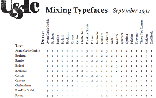
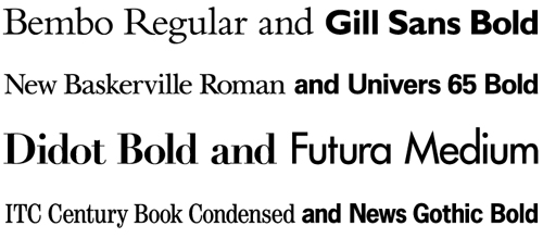
Though the output of your dot matrix printer was unmistakable and monotonous, at least you never had to sweat the aesthetics of combining type. Matching heading fonts with body fonts, accent fonts and footnote fonts can be a touchy pursuit. Even perfectly balanced fonts can look ungainly and ugly next to the wrong neighbors. If type is the most important aspect of web design, then combining type is a critical skill. You may also want to take a look at the following related posts: Unfortunately, it’s also a hard skill to master intuitively. Sharpen your eye for font combinations by taking a crash course in type combination. These links are rife with great explanatory graphics and even better advice. You’ll be mixing type like a pro in no time. When you need a type combination and you need it immediately, check out Douglas Bonneville’s 19 Top Fonts in 19 Combinations. This cheat sheet culls the 19 most popular web fonts, imagines them as headers, and pairs them with foolproof body text choices. Better yet, the convenient cheat sheet shows the pairings together, so that you can merely choose a duo that meets your needs. For a more in-depth version, try this arrayed infographic codifying 22 possible type combinations. Though it doesn’t provide a visual key, it does offer a quick reference for the advisability of 484 possible pairings. And just because you’re entirely in need of some friends for Helvetica, keep this FontShop list handy. Helvetica-savant Indra Kupferschmidt provides an array of choice Helvetica helpers, as well as a first bit of insight into the theory of font pairings. With those immediately accessible type pairings at your elbow, it’s time to incorporate a bit of theory so that you can choose your own. A common theme in the cheat sheets is contrast – for example, serif typefaces are paired with sans-serifs, and vice-versa. Yet the key to well-balanced contrast pairings is to look for subtle similarities. Take a gander at Peatah.org’s combination chart, and follow up with BigBrand’s golden combination rule: Look for similarities in the letters a, g and e. Hoefler and Frere-Jones’ Four Ways to Mix Fonts explores a breadth of font combination concepts and their uses. This article and its multitude of examples provide guidelines rather than dogmatic combinations. The most necessary quality of a pairing is that both unity and variety are preserved. H&FJ’s pivotal tenet: When combining fonts, let one design feature stay the same. Let one other thing vary. These links alone should be enough to serve your basic font combination needs. For advanced study, try Robin Williams’ well-considered Layers Magazine article or Dmitry Kirsanov’s article on type matching theory.

Learn to Combine Fonts – the Essential Basics
Get Help on Helvetica Combinations
Learn to Create Well-Balanced Contrast Pairings
Further Reading:


0 comments:
Post a Comment